The ultimate React Native Toolkit
Launch industry-levelWe ❤️ Expo
Create a new app in seconds using our Expo templates
1Get your license (Pay once, unlimited use)
2Follow these steps to create your new project
# 1. Create a new project
# js template
expo init my-app --template @spirokit/expo-template
# typescript template
expo init my-app --template @spirokit/expo-template-typescript
# 2. Add your SpiroKit copy
yarn add ./spirokit-core-[version].tgz
# 3. Run your app
npm start
⚡️ Save time
Get access to our App templates catalog, and start saving hundred of hours of development work by using an App Template as your starting point. Every template includes:
One-liner template starter:
#Travel App
expo init my-app --template @spirokit/travel-app-template-typescript
#Ecommerce App
expo init my-ecommerce-app --template @spirokit/ecommerce-app-template-typescript
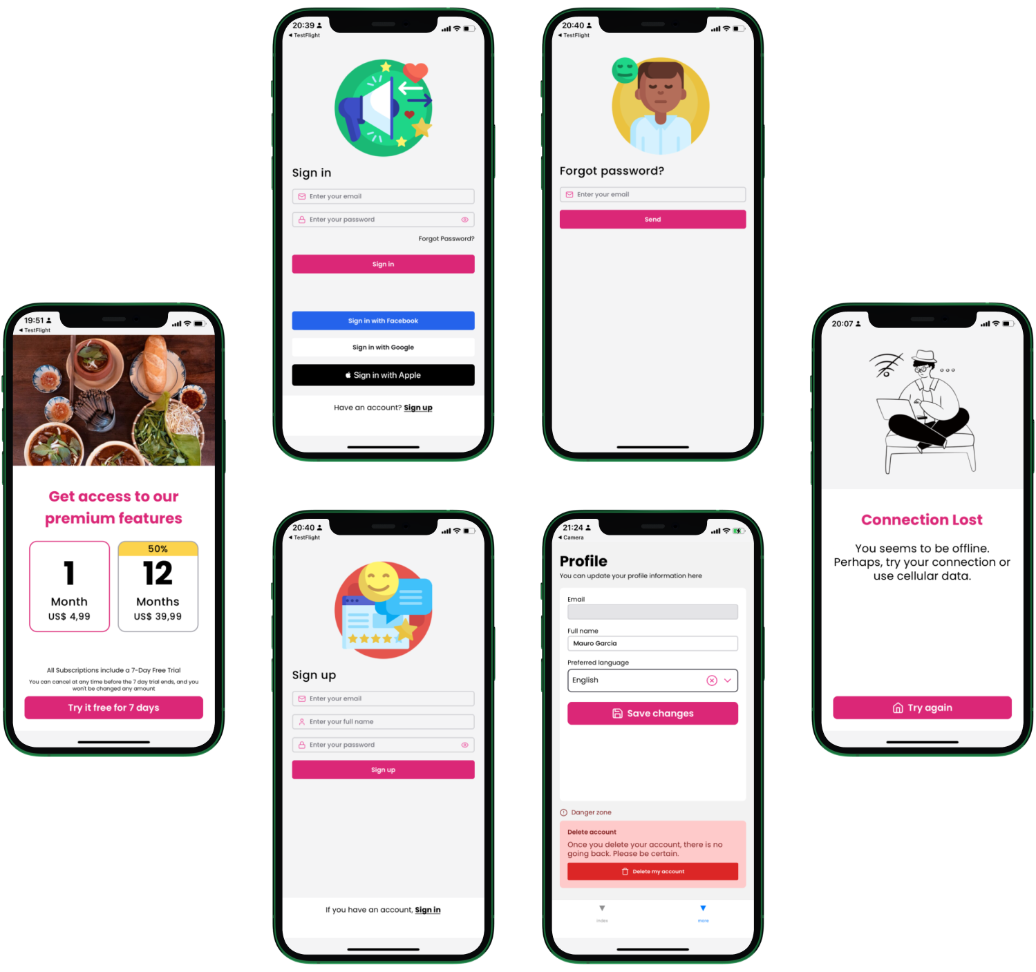
Entire screens like Home, Search, Sign in, Sign up, Profile, and more to help you ship your idea faster.
Dark mode: All the screens are ready to use in light and dark mode.
Figma UI Kit (Included with the Figma and Bundle licenses)
Navigation: We use react-navigation to implement common patterns like bottom tab and stack navigation
🎨 Themeable
Choose between 17 built-in color palettes
Add your custom color palettes and fonts
Apply your theme globally with the SpiroKitProvider
import { Button, SpiroKitProvider, useSpiroKitTheme } from "@spirokit/core"
const myTheme = useSpiroKitTheme({
config: {
colors: {
primary: "blue"
}
}
})
const App = () => {
return (
<SpiroKitProvider theme={myTheme}>
<ScrollView contentContainerStyle={{ flexGrow: 1 }}>
<Box height={48} width="full" backgroundColor={"primary.500"}></Box>
<Box safeArea position="absolute" flex={1} padding={4} width="full">
<LargeTitle marginBottom={2} color="white">News</LargeTitle>
<VStack
flex={1}
space={4}
padding={2}
borderRadius="lg"
backgroundColor={useColorModeValue("white", "primaryDark.1")}
>
<HorizontalCard
BadgeComponent={<Badge>Travel</Badge>}
AssetLeftComponent={
<Image source={{ uri: "https://i.imgur.com/EflHxyi.png" }}></Image>
}
TitleComponent={
<TitleThree>Emirates introduces digital health verification for UAE passengers</TitleThree>
}
DescriptionComponent={
<Subhead>
Emirates and the Dubai Health Authority (DHA) have begun to
implement full digital verification of Covid-19 medical records
</Subhead>
}
userName="Kenny Grimes"
UserAvatarComponent={
<Avatar source={{ uri: "https://i.imgur.com/mwax0m0.png" }}></Avatar>
}
DateComponent={<Footnote>15th June 2021</Footnote>}
></HorizontalCard>
<VerticalCard
BadgeComponent={<Badge>Travel</Badge>}
TitleComponent={
<TitleThree>British Airways app allows economy passengers to order food to seat</TitleThree>
}
userName="Antoinette Crona"
UserAvatarComponent={
<Avatar source={{ uri: "https://i.imgur.com/8BWJYvV.png" }}></Avatar>
}
DateComponent={<Footnote>15th June 2021</Footnote>}
></VerticalCard>
<Button IconLeftComponent={BellIcon}>Notify me</Button>
</VStack>
</Box>
</ScrollView>
</SpiroKitProvider>
)
}
🧩️ Extensible
SpiroKit applies the atomic design philosophy, meaning that you can create your own components by mixing and matching the existing ones.
Full access to all the available design tokens (colors, fonts, size scale, etc) using hooks
Unlimited layout options by combining powerful primitives inherited from Native Base (Box, VStack, HStack, Center, etc)
const ShoppingCartItem = (props: { colorMode?: ColorMode }) => {
return (
<HStack
borderRadius={"lg"}
borderColor={useColorModeValue("primary.500", "primary.300", props.colorMode)}
backgroundColor={useColorModeValue("white", "primaryDark.4", props.colorMode)}
padding={4}
borderRightWidth={8}
>
<Image
source={{
uri: "/path/to/adidas/tee.png"
}}
width={32}
height={"full"}
borderRadius="2xl"
></Image>
<VStack paddingX={4} flex={1} space={2}>
<TitleThree color={useColorModeValue("primaryGray.900", "white", props.colorMode)}>
"Own the Run" Men's Tee - Adidas
</TitleThree>
<Body
color={useColorModeValue("primaryGray.900", "white", props.colorMode)}
fontWeight={"bold"}
>
Size: Medium
</Body>
<LargeTitle
color={useColorModeValue("primary.500", "primary.300", props.colorMode)}
fontWeight={"bold"}
>
$35
</LargeTitle>
<HStack space={4} alignItems="center">
<Button
colorMode={props.colorMode}
size="sm"
width={"auto"}
IconLeftComponent={MinusIcon}
></Button>
<TitleThree
fontWeight={"bold"}
color={useColorModeValue("primaryGray.900", "white", props.colorMode)}
>
1
</TitleThree>
<Button
colorMode={props.colorMode}
width={"auto"}
size="sm"
IconLeftComponent={PlusIcon}
></Button>
</HStack>
</VStack>
</HStack>
)
}
📗 Document-Driven
Get access to a comprehensive and interactive documentation portal that includes:
1Installation guide
2Theming tutorials
3Design tokens reference
4Tons of working examples for every component, ready to copy paste.
5Full page examples Coming soon
6Full app examples Coming soon
🌙
SpiroKit allows you to set a color mode (light/dark) based on your users preferences. You can also use the useTheme hook to toggle between light and dark when and where you want.
Choose between light / dark mode using the SpiroKitProvider configuration to apply your preference globally
Automatically adapt your app based on your user’s device mode
Override the color mode per component
const myTheme = useSpiroKitTheme({
config: {
initialColorMode: "dark" // Force dark mode globally
}
})
const App = () => {
return (
<SpiroKitProvider theme={myTheme}>
...
</SpiroKitProvider>
)
}
❤️️
🔨 Development experience
SpiroKit heavily relies on declaration files (d.ts files) to provide you with great IntelliSense for every built-in design token.
Color palettes
Sizes (used for width, height, etc)
Fonts (line height, letter spacing, font weight, etc)
We are working on a new VSCode extension that will allow you to quickly scaffold complex components to further improve your development workflow.
🎨 Designer
⭐️ Popular
SpiroKit for Figma
SpiroKit for React Native
Coming soon
Example App boilerplatesComing soon
Full page examples👨💻 Developer
Coming soon
Example App boilerplatesComing soon
Full page examples